In a time when AI is redefining how brands are built, REGULAR ANIMAL proves that soul still matters.
Miami, FL — Amid the rise of generative design and algorithmic branding, REGULAR ANIMAL has taken a different route—one that’s human at its core. The Miami-based creative agency partnered with Agris, Africa’s leading sustainable agriculture company, to reimagine its brand identity. The result: a bold, tactile, and deeply human brand system that honors both innovation and the land.
Agris, a subsidiary of Maris Ltd., is no ordinary agriculture company. With operations spanning commercial plantations, horticulture, and farmer training, they employ over 1,500 people and support more than 14,000 smallholder farmers across the continent. Yet their public image didn’t reflect this impact. Too often, they were mistaken for a simple fresh herb distributor.
What made the challenge more complex was Agris’s layered brand architecture—spanning both B2B and B2C audiences, and operating across multiple markets from the Middle East to Northern Europe. REGULAR ANIMAL had to create an identity system that could unify diverse business lines under one clear, compelling story.
Shifting Perception, Seeding Identity
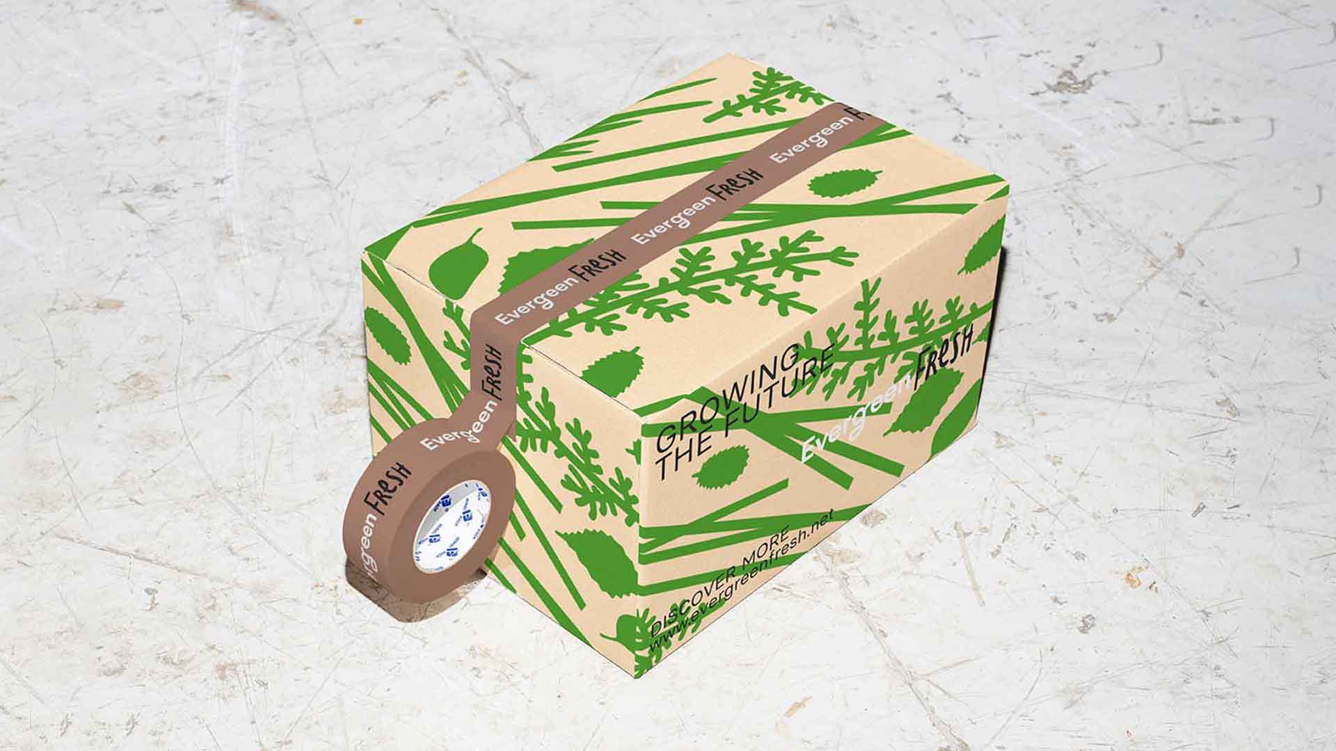
REGULAR ANIMAL was tasked with shifting perceptions—crafting an identity that could carry the weight of Agris’ work while feeling modern, inclusive, and alive. The agency’s creative breakthrough came from a subtle but powerful detail: the letters “GR,” a shared feature across Agris’ sub-brands (Evergreen Fresh, Evergreen Herbs, Evergreen Avocados, etc.). From this, a visual metaphor emerged—a seed, sprouting into a symbol of unity, resilience, and transformation.
Where Geometry Meets Humanity
The new identity pairs geometric precision with organic imperfection. At its core is a monogram built from the “GR,” paired with Basier Circle, a clean, minimalist typeface from Atipo. To offset the cool rationality of the geometry, REGULAR ANIMAL introduced handcrafted lettering—each character unique, drawn by hand, and infused with irregularities that echo the tactile world of farming.
“We wanted to create a system that felt grounded and real—something that couldn’t have been generated by an algorithm,” said Ana Meira, Partner at REGULAR ANIMAL. “In a moment when AI is everywhere, it was important that this brand felt human.”
A Client Restored
While the project delivered a bold new identity, its most powerful impact was emotional. After seeing the final result, YC, an advisor to Agris, shared: “You made me recover my faith in the human race.”
At a time when branding is increasingly shaped by algorithms and automation, this reaction says it all. The new identity wasn’t just beautifully executed—it was deeply felt. It reflected the care, intention, and humanity that define both Agris and REGULAR ANIMAL’s approach.
Illustrating a Bigger Picture
To tell Agris’ story in full, REGULAR ANIMAL developed custom illustrations—depicting everything from cooperative farming systems to regenerative land practices. Rendered in fresh tones and natural shapes, these visuals add richness to the identity while reinforcing the brand’s environmental mission.
Design as a Living System
The result is a brand identity that is more than just beautiful—it’s alive. It grows, evolves, and connects. It reflects Agris’ mission: to cultivate not only crops but also livelihoods, communities, and ecosystems.
At a time when technology often overshadows craft, this project is a reminder that meaningful design is still rooted in the human touch. With this new identity, Agris is poised to lead the next era of sustainable farming in Africa—and REGULAR ANIMAL has once again proven that design done right doesn’t just look good. It restores, inspires, and endures.