Branding sound, one amplifier at a time
What does sound look like? That was the question that sparked Amplifiers in Three Acts — a branding experiment that turns tone into typography, circuitry into language, and design into resonance.
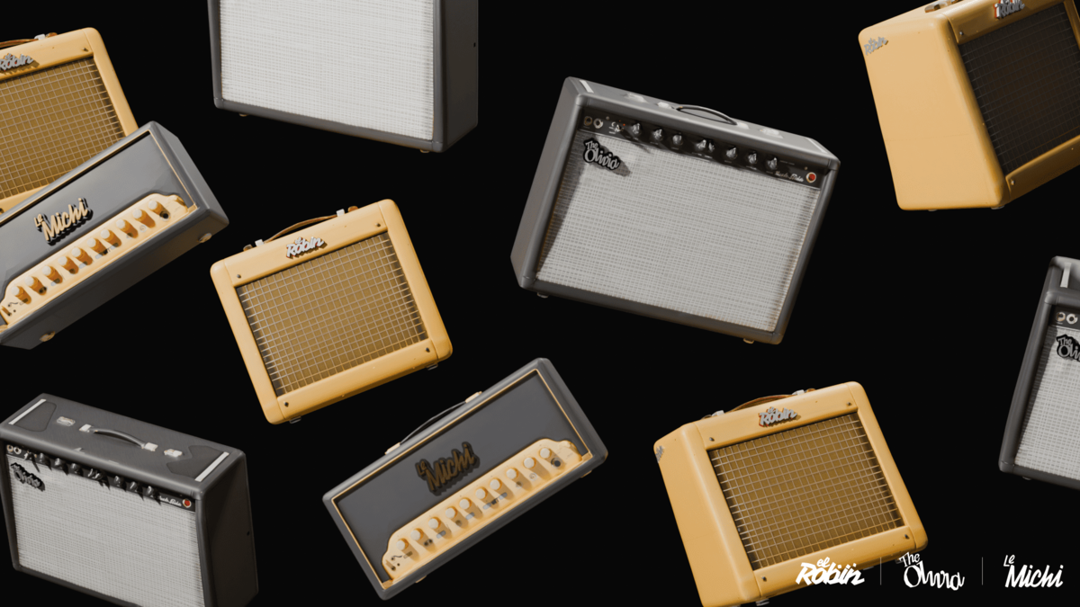
When REGULAR ANIMAL was approached to give visual identity to a trio of amplifiers, each engineered with a distinct sonic personality, the challenge was clear: create a system where every amplifier stands apart yet plays in harmony with the others — like three instruments in the same band.
Act I — The Concept
Each amplifier was built with its own tonal character:
Le Michi — agile and adaptable, with a fast transient response and a clean tonal core.
The Olivia — refined and elegant, tuned for balance and detail.
El Robin — raw and untamed, built for presence and power.
Together, they form a setlist — three voices tuned to different registers, three characters that tell one collective story through sound.
Act II — The Design
Our task was to translate these sonic signatures into a visual system.
Typography became our circuitry — each logo imagined as a waveform drawn in letters, a frequency captured in form.
Le Michi — Compagnon Bold
Rounded yet sturdy, balancing strength and warmth. A visual echo of the amp’s clean tonal center and quick response.
The Olivia — Avara Bold Italic
Fluid, graceful, and forward-leaning. A typeface that sustains its own note — refined, resonant, and precise.
El Robin — Vampiro One Regular
Jagged and emphatic, alive with voltage. The visual equivalent of distortion at full gain — bold, unpolished, and impossible to ignore.
Each logo speaks its own language, yet together they compose a visual harmony — distinct timbres balanced into one coherent mix.
Act III — The Collection
Placed side by side, Le Michi, The Olivia, and El Robin don’t just look related — they resonate.
Each identity carries its own tonal weight, yet together they create rhythm and cohesion, a harmony of difference. The result is a collection where branding doesn’t just label technology — it amplifies it.
These aren’t merely logos; they’re signatures of tone, visual echoes of circuitry, and proof that design can make sound visible.